
Starting your Own OSR Zine
An Interview with Golden Achiever

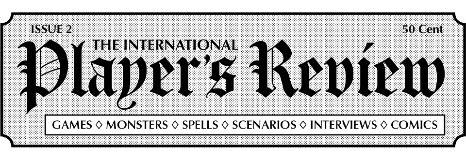
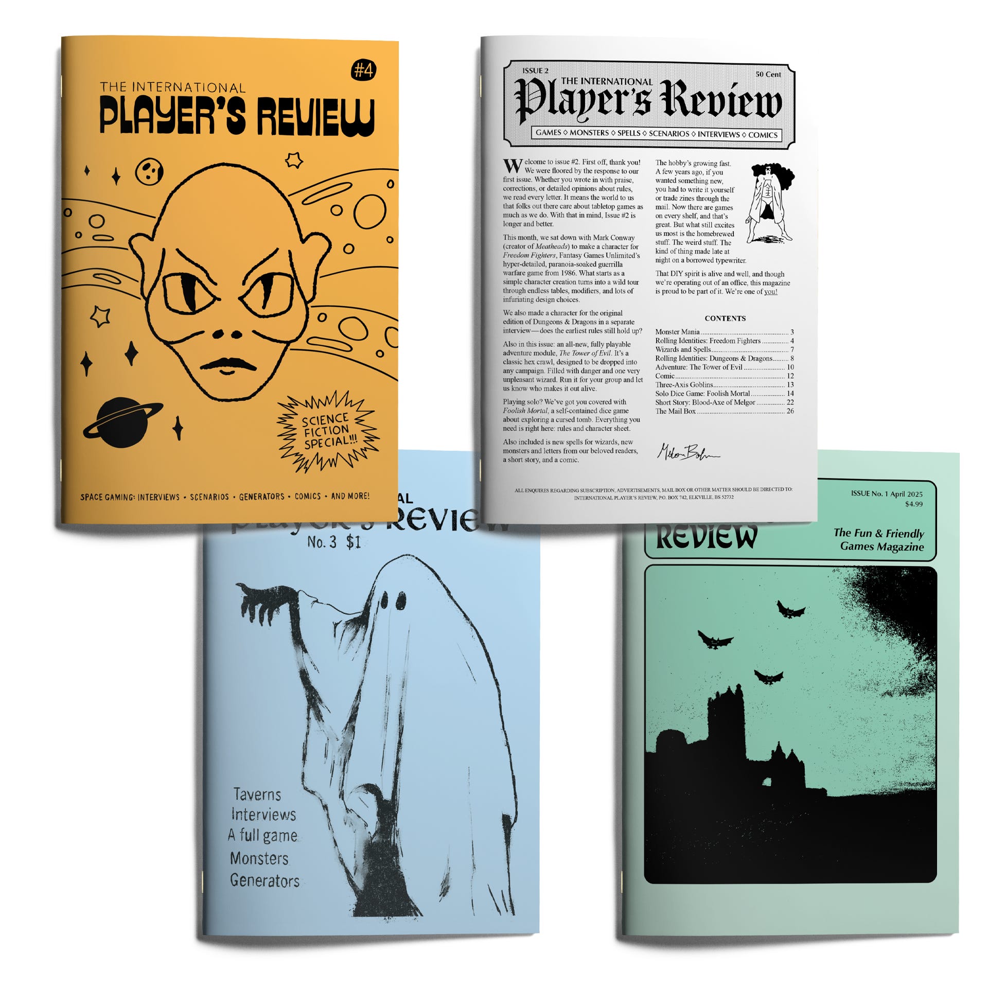
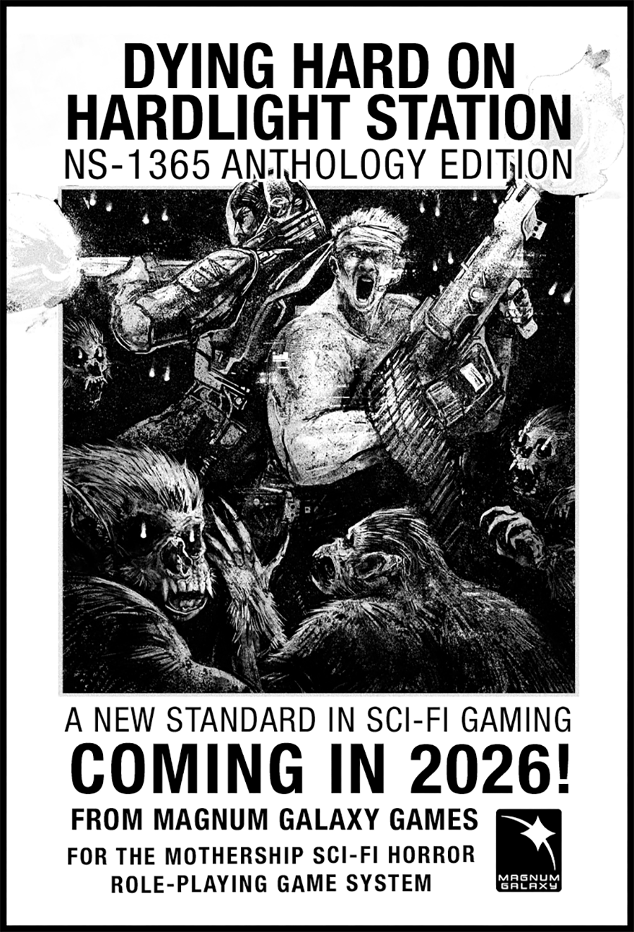
I recently teamed up with my long-time collaborator Golden Achiever to launch the first print run of his semi-quarterly OSR zine, The International Player’s Review. Golden Achiever and I have worked together on nearly all my Mothership publications, including Dying Hard on Hardlight Station, The Cleaning of Prison Station Echo, and both editions of Nirvana on Fire. His signature blend of clean, stylish design has become a defining part of how my books look and feel.
What readers might not see in my releases, though, is his behind-the-scenes humour: odd, sharp, and very funny. That sensibility is on full display in The International Player’s Review. Inspired by 1970s Dragon Magazines and other early TTRPG publications, IPR is scrappy, handmade, and full of gameable OSR ideas while also being a complete world of its own. Much like how Luka Rejec built an alternate fantasy reality with Ultraviolet Grasslands, Golden Achiever is crafting an “early OSR that never was,” and I’m excited to play in that space.
Even if OSR isn’t your usual thing, my conversation with him is a rabbit hole of fun ideas to explore, and accessible design advice from a humble pro. Plus the latest sci-fi issue is packed with ideas I’m stealing for my Mothership games, and you can too. So, on to the interview!
Dave: What inspired you to start The International Player’s Review?
Golden Achiever: I’ve always had a weakness for amateurish graphic design in old zines. To be honest, I don’t exactly remember why the first issue got made, but it happened in a violent spurt of inspiration. The first issue took maybe 24 hours to finish after the idea came to me. But I had some material already mostly done on my computer.
Dave: Helium Hysteria happened like that; I read a short article about medical conspiracies and had a working draft three hours later. How about you? Where do your ideas come from, and what does your creative process actually look like?
Golden Achiever: Usually my ideas are literal shower thoughts. Then I sort and cull, the ideas that hold water make it into an issue. When I actually sit down to write and create for IPR I try not to overthink. I want things to be unruly, I kinda want you to get an inkling how the sausage is made (without having to smell the factory) when reading. I try to hone in a viewpoint I don’t see otherwise.
Anyway, broad strokes: I do layout in tandem with the actual writing. It’s a terrible workflow which I wouldn’t recommend, but it really helps me to feel if an idea is right for IPR. First pass is fast and dirty, then I reiterate until it’s good or I decide to scrap the idea.
Dave: I like that sense of instinct; knowing when something “feels right” for the zine. How do you know when an idea belongs in IPR?
Golden Achiever: It needs to be a bit unruly. I can’t get inspired by a concept like “in this issue I should include a hex fill procedure”. I get inspired by ideas like making a demented knight or challenging myself to make an adventure on only two a5 spreads.
Dave: Looking back at the first four issues, what are some of your favourite articles, pieces that really nail the vibe you are aiming for?
Golden Achiever: From the first issue my favorite is definitely Easy Money. I’m proud of that one. It’s a super compact adventure with a premise that seems simple on the surface but will catch players off-guard. If there were conventions in my neck of the woods I would bring it there, it’s perfect for that.
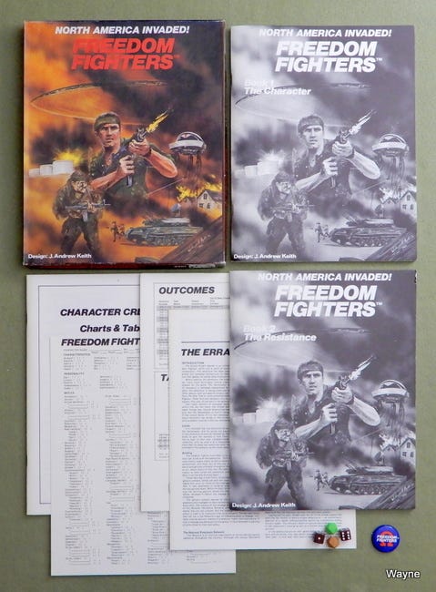
From issue 2 I really enjoy the character creation report for the game Freedom Fighters (from 1986). There is no defending how they designed that. It’s bogged down in needless simulation and realism. Making a character requires approximately 10,000 dice rolls, countless hours and tears. It’s genuinely fascinating.
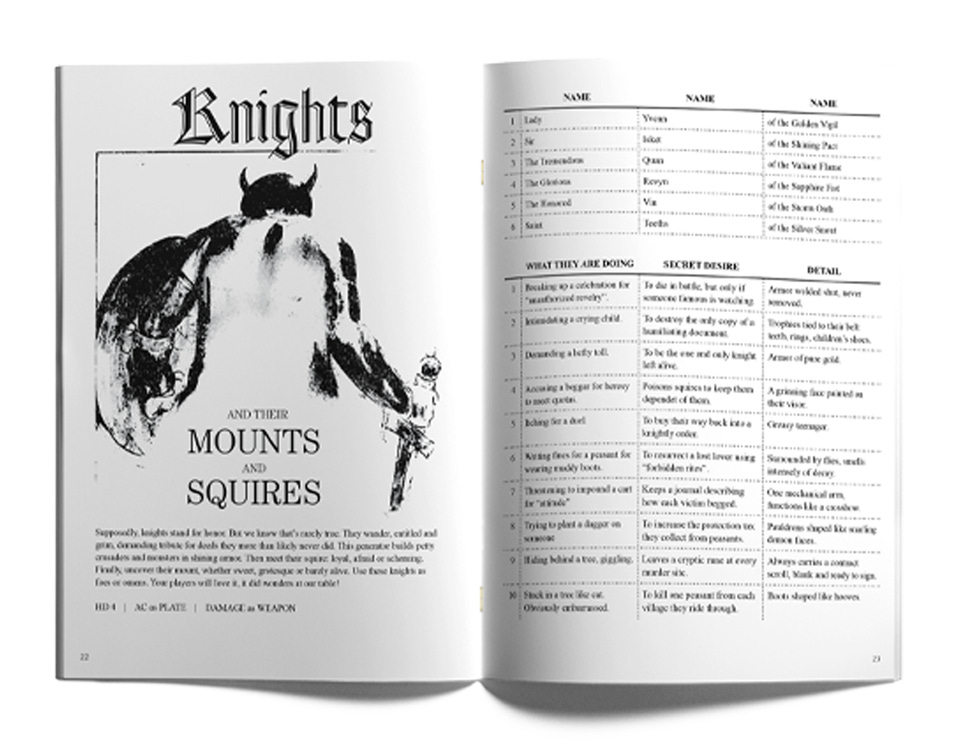
From issue 3 my vote goes to the knight generator. It lets you generate knights, with a flavor I’ve not seen anywhere else. Knights seem like great candidates for petty, fearsome and dynamic antagonists, and this table does a good job at bringing that to the table.
Issue 4? Damn, it’s all very new. But if I have to choose I think I’ll put forward the robot generator. It is similar to the knight one, but, whereas the knights are just plain evil for the most part and want to end you, the robots might not understand that what they are doing is despicable.
Dave: Let’s dig into inspiration a bit. You’ve always had a love for the old, strange, and obscure. What OSR games do you enjoy the most right now, and what would you recommend readers check out?
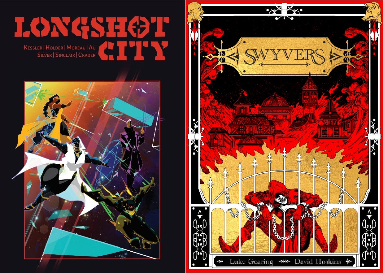
Golden Achiever: I really enjoy Longshot City. I don’t know if that counts as OSR? It’s a superhero game that is a whole lotta fun even if you, like me, don’t know jack shit about superheroes.,
I’ve also thoroughly enjoyed playing Swyvers. The setting is fantastic, it’s a thief’s playground of a really dirty fantasy version of London. You play little smelly shits robbing mansions. Most characters start off illiterate. The game has a distinct voice I haven’t seen elsewhere.
Both those games are fantastic, wildly different from each other and neither game gets enough attention.
Dave: How about design inspirations: games, books, media - what shaped your approach with IPR?
Golden Achiever: Space Gamer, Dragon Magazine, White Dwarf and a bunch of old APA (amateur press association) zines. As well as old UFO zines and other esoteric nonsense I found on archive.org. You can find and read a lot of the old rpg magazines there. Just browsing and looking through the ads there is inspiring, the exploration and unbridled excitement is tangible. Specifically the ads served as a big inspiration for IPR, that is why I’m including ads in each issue.
Dave: This is exactly the kind of design rabbit hole I was hoping you’d get into. Mountains of creativity from an age that feels both close but also incredibly far away; refreshingly scrappy and handmade. On that note, you are an entirely self-taught designer if I’m not mistaken. Are there any free resources, articles, tools, or art sources you’d recommend for new designers?
Golden Achiever: Yeah, I’m totally self-taught. I just smashed my head at the software until I could make it do what I wanted. But I’ve always been interested in graphic design, and had some basic knowledge about the concepts before I started learning. Speaking of which, for graphic design I really recommend glancing at The Vignelli Canon, it’s a bit outdated but provides a solid foundation when you are starting out. Massimo is a bit too rigid though, you shouldn’t take his word as gospel.
If you want to learn a bit about type Pangram Pangram has a good article. It’s a quick read and will give you a good basic understanding of concepts and terminology. Nevermind their shop, typefaces are expensive!
Speaking of which, when choosing a body font you should go with something battle tested but when you want a funky header you can find some good display fonts at velvetyne.
For art I use the usual suspects for public domain stuff that I then photobash and then trace over, keeping true to some obvious trace jobs from the early days of the hobby.

Dave: I love it. The front page of Velvetyne sets my brain on fire. I feel like I could write an adventure inspired by each of those title fonts. Also shout out to the obvious trace jobs. There’s a lot of love in sloppily stealing from your inspirations to make something fun for your friends.
Ok, last question. For the sci-fi issue, is there anything you could point the Magnum Galaxy Gazette readers towards that pairs well with Mothership or sci-fi horror generally?
Golden Achiever: The tables included in the sci-if issue are designed to be system neutral but definitely informed by how I interpret Mothership. I’ve made them to serve as launch points for greater encounters or as expansions to ongoing campaigns. Space is big, there’s room for anything there. Pretty much everything I do has a dark undertone to it, I can’t help it. So I’d say it certainly fits with Mothership.
That wraps our interview. I hope you enjoyed this deep dive into Golden Achiever’s zine and design process. I’ve always loved working with him and it’s awesome to see him build his own zine to unleash everything he has to offer from design to comedy, fiction, and RPG tools.
If you haven’t already, go check out The International Player’s Review Annual live now on Backerkit for the Holiday Market. It is the only print run he’s ever done and we’re keeping it small so we can ship copies for the holidays.
Thanks for reading. I hope the links and ideas spark your inspiration to create something, maybe even an adventure or generator of your own.
All the best,
Dave